I had a package in the mail on Friday, May 8th. I had forgotten that I ordered the April Mythoard. However, I had a feeling that there was something that should be coming in.
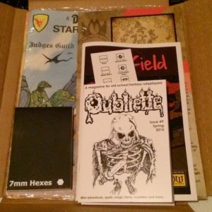
I had not planned to get it, but when I saw that it contained the latest edition of Oubliette #9, I was curious. I had read other positive comments about it, and knew that I would get some other cool goodies along with it, so I took the plunge.
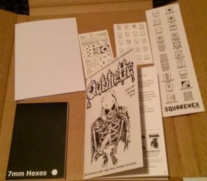
Along with Oubliette #9 are several other goodies from Squarehex. There is a book mark with large squares on one side and the other side contains large squares with dungeon map symbols. There are two business card sized items. One is blank on one side, and the other side had hexes with outdoor map symbols. The other small card has dungeon map symbols that are black and the other side has the same symbols in gray with labels to explain them. I am not sure if the purpose of these symbols is to give you an example of what such symbols “should” or might look like, or if you are supposed to put them under your hex paper to help you draw a very neat map.
There is a folded piece of graph paper the same size as the Oubliette issue with the grid on the outside. The inside of the graph paper has the OGL license. I wonder if it it the innermost page of the zine, and did not get stapled. Finally, there is a small pad of 7 mm hex paper. The pad it not as wide as a business card, and it is about as tall as two business cards top to bottom. It is so small that it is for a very small area and it well suited to a micro map.
I expected the Oubliette zine to be a full page folded over, instead it is about a half page folded over. The introduction indicates that this is not the usual size. It is a slick card stock cover with click heavy weight interior pages. It is 20 pages counting the back cover, which is a table for generating hit points of creatures from 1/2 HD to 2 HD using a roll of one or more d20’s. Six pages are a mini adventure, two pages with four new spells. two pages on a variation on familiars, four new magic boots, a new monster, and second mini adventure of three pages. While not every idea will be used by everyone, there is a lot in these few pages.
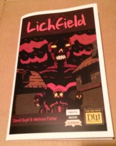
Awful Good Games has a booklet that is zine sized, i.e. half a page folded over. It is a module of 31 pages. It has a slick card stock cover and slick heavy paper for the pages. The text is black over light grey. It is legible as long as the slick paper does not have any glare. Older eyes with bifocals can have trouble with this. If you avoid glare on the page, unless your eyes are worse than mine, you will be able to read it.
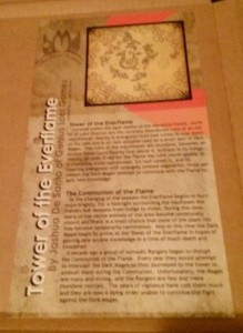
Next is a mini setting, a half page top to bottom ready for a standard three ring binder on slick card stock. It is black ink on a lightly colored background. It looks great, and as long as there is no glare, it too is easy to read. It continues adding to the Mythoard setting. I like that they keep adding things to the existing setting. If you want to use this setting in whole or in part, it is easy to do with this. I was glad to see that past month’s offerings are available. I would like to have the complete series of materials, if I can.
Next is a Pathfinder compatible supplement from AAW Games. It is For Rent, Lease or Conquest. It is a module about obtaining a home base for the party. It is a 42 page adventure. It is in a slick cover and the pages give one the visual impression of newsprint, but are slick and heavier than newsprint. The print is black ink on a multi-colored background. Most of each page has a light background, and thankfully the slick pages are not shiny. However, lighting and the angle the page is held can make words over darker ink harder to read for older eyes with bifocals. In addition, the layout has the text on some pages running into the border decoration. I think the intent is to look cool, but since it is hard for me to make out the text in some areas, and not every page is crowded, I think it is a layout issue. When the young eyes of the layout people read this stuff in 20 or 30 years, they will curse their younger selves. It is worst in sections of the page where the background color transitions from lighter to darker. Some letters disappear. In the corners of some pages is a leaf motif that goes light, dark, light and the odd color transition takes more concentration to read. I find that prolonged reading of this starts the feelings of a headache. It reminds me of the original PDF of D&D 5 where it had a colored background and was very hard to read. It seems like the intent is to go after the younger crowd at the expense of the older crowd.
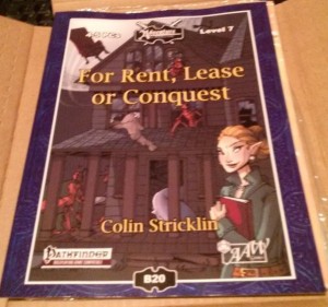
The premise of the module is buying/occupying a building for home base and the villain is the realtor. I do not find that entertaining. As a homeowner who got screwed in the housing collapse, it is too much like papers and paychecks. That plus the difficulty in reading it, I don’t know if there are any useful nuggets in here.
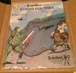
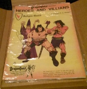
Finally, there are two Dragon’s Quest adventures from Judge’s Guild: Starsilver Trek, and Heroes and Villains. They are in clear sealed plastic. If this is the original plastic and still sealed, do I want to open them? While these were from Bad Mike’s Books and Games, are they worth more sealed? There are definitely from back in the day and the art is of the sort that did not draw me in back then. Some of the JG stuff is really good and I wish I had delved into it back then.
So there is a lot of stuff in here. Some of it is for younger/better eyes than mine. As with “grab bags” one cannot expect everything to hit the sweet spot.
I found some things to interest me, and some ideas for later.

