Tag Archives: Modules

Review – Rob Kuntz’s Dark Druids

Rob Kuntz’s Dark Druids was on sale a few weeks back. It arrived at the end of April. Since my submission to the 2015 One Page Dungeon Contest involved druids – The Dire Druids of Delver’s Deep, I waited until after I completed my submission to read this module. My planned postings got sidetracked, since I jumped on board the White Star bandwagon.

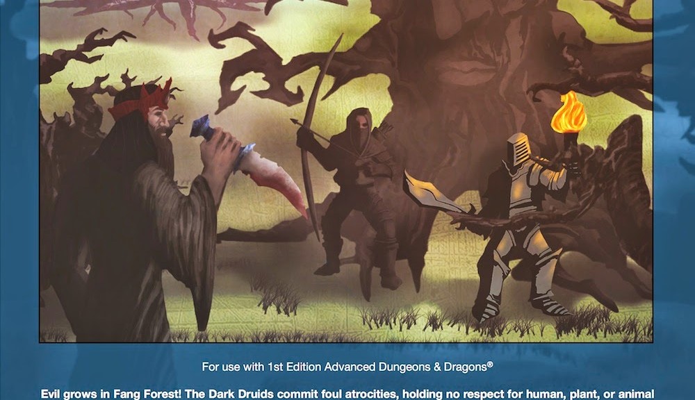
This module clearly states on the cover below the illustration: “For use with 1st Edition Advanced Dungeons & Dragons(R)”. Unlike others, it is not afraid to say this and also acknowledges that the name of the game is a registered trademark. It is one of three modules currently available from Chaotic Henchmen Productions.

The blurb from the back cover explains what this module is all about: “Dark Druids includes complete descriptions and maps for an outdoor area and a three-level adventure site, and is easily adaptable to most campaign settings. It also includes an outline for further adventuring, a selection of new monsters, spells, and magic items, plus Robert J. Kuntz’s historical context and commentary on this module’s relationship to his campaigns of the 1970’s”

This module is designed for levels 8-12, so it is not a low power adventure. It has the general look and feel of a module from back in the day. The cover can serve as a screen and includes the 1st and  3rd level of the dungeon. The 2nd level is on the last page of the module. This 56 page module has more maps for the outdoors area and illustrations to compliment the text.

After a forward and author preface, there is a section on Using the Module that discusses party composition and challenges, preparations before play, and how to read and interpret the module text. There is a player introduction, which is a lot of text to read. Lastly there is a half page of rewards and additional party resources.

After a page for the GM introduction, there are just over three and a half pages with the outdoor map, starting text, and key to the outdoor map.

The dungeon’s three levels are detailed on pages 9 through 35.

There are seven appendices, A through F.

A – Deals with further adventuring against the drak druids.

B – Is an article about a Dark God.

C – Discusses changes in this version of the module from the 2006 version published by Creations Unlimited.

D – Lists the 16 new magic items in this module.

E – Details four new monsters.

F – Describes the dark druid variant class.

The module was well sealed in cardboard and bubble wrap and sealed with scotch tape in a clear plastic magazine sleeve.

I like the look and feel of this. The maps are well done and easy to read. The text itself is laid out well and easy to read. However, the “Read-aloud text” is in italics. For some rooms this text is the first part of that room’s description, but for others it is later. Thankfully, while not like some italics fonts that I sometimes have trouble distinguishing from the normal font, there is nothing else to set it apart. When actually running this, it would be very easy to miss a key detail. If I were to run this module as written, I would have to use different colored highlighters and ink to note the important parts. I find this to be more of a concern as my eyes age.

When not in a live game situation and no pressure, it is definitely easy to read. There is a lot of information here, it is dense.

It is something that would require a lot of streamlining to run in a con setting. In a con setting it is bigger than can be handled in the average 3 or 4 hour session. There is enough in here, that it would take one massive marathon session to complete the entire module in one go. I can see this easily taking many sessions depending on the focus of the players, and the decisions and rolls they make.

One can easily place this on a list of possibilities, when players get to that level, and fit it into the campaign. AD&D is not that much different from OD&D and modern clones, that this could easily be used in nearly any OSR game. There is a lot in here, that it will take more than a casual reading to catch all that is in here. This could easily be part of a behind the scenes activity that builds up to this module, or it could be a new stand-alone threat. Because this is so dense, I have not managed to read the whole thing carefully, but I like what I see.

This is an interesting concept and ties in with my articles on druids.

Review – Distress Signal Tundara

Distress Signal Tundara is a new adventure module for 3-6 adventurers of levels 1-2 compatible with White Star. After the cover, title page, one page of deck plans and the final page for the OGL, the rest of this 17 page PDF is the text of the adventure. In addition, it comes with two image files for the deck planes, one with a grid for the GM and one without the grid for the players.

There were only minor production issues. I noted was one typo in the first few pages. A description of a creature used yards, when the map is in meters. And the non-grided map makes reference to the scale of the grid, which is missing. Other things referred to feet using the apostrophe character, which is part of White Box information, so not a problem of the author.

Each referee will have to work out for themselves, whether to use English or metric units, and whether to convert White Box feet to meters. Where outdoor movement is in yards, this is easy enough to hand wave as meters. Feet can be crudely approximated to 1/3 of a meter. Personally, I prefer to use metric in a Science Fiction game, but having been raised on English units, I think in those units, so not a problem for me.

The author did his own graphics, with some open content. I like the cover and the deck plans provided.  It would be nice if the original and now damaged area of the ship were shown in outline, so one knew it’s original structure. But that is only my desire for a complete deck plan for future use. [One thing I wish I had was a 75% view of the ship. Not to detract from the module, but something I feel would be cool to show the players from their scans/view of the ship on approach. The burst of new ship types and graphics by some on the White Star community can help fill this want.]

The premise of this adventure is not entirely new, but is presented in a way that is clear, concise, and ready to run after a quick read and a few minutes to think of how to approach it.

The GM is left to determine how the players are in the area, whether as passengers on a ship, or a ship of their own. This is not a major issue, as it allow the module to fit into an existing campaign, or be a one-shot.

There is enough detail in each area of the ship, that curious and careful players will manage to find something in most rooms. However, there are notes that the referee will have to fill in things that he or she feels are necessary in their game. There are also hazards for players that are rash and forget that there are in space. The issue of explosive decompression of a hatch that is forced open is dealt with, as I was thinking about how I might handle it as I began the text, there it was a bit further in. Excellent!

Several NPC’s are suggested for various ways that the GM might impact the scenario. This gives maximum flexibility to work into existing campaigns, or ideas for similar adventures. There are also potential plot hooks that could lead to more adventures that can easily fit into an existing campaign.

This seems like a scenario that would be a good fit for a con, but I don’t know if it would fill a four hour slot. Still, it might be fun to try it.

There is a lot here for $1.00. I think that I would enjoy playing this as a GM or a player.

Funny: At first glance, I thought the title was Distress Signal Tundra. Tundra made me think of ice, and I thought of the movie, Ice Station Zebra. Now I have thoughts of a White Star scenario on ice. Now all I need is Snoopy….

Review – Star Temple of Saturgalia

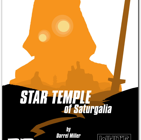
The first(?) available third party adventure for White Star, Star Temple of Saturgalia is a six page PDF, that after the cover and OGL leave four pages for the adventure.

This was billed as an introductory adventure. Nowhere in the PDF does it indicate that is is for low level characters. It is obvious from a reading of the text that it is for a group of low level characters.

The method of handling encounters almost guarantees that there will be three space encounters en route to the planet. Instead of a 1 in 6 chance of there being an encounter, there is a 1 in six chance of no encounter. The odds of the encounter ignoring the players or being friendly combined are 50% or greater. So even if there is an encounter, it does not guarantee a chase or fight. The intent of the designer is to have tension. If one is playing up to the tropes of the genre, this is understandable. However, the GM is free to handle this his or her own way.

Once on the planet, there are two encounters, potentially competition from an NPC party, or natives are the greatest possibility. A natural disaster or a creature encounter are also likely. The use of bumble dogs, or a new creature, the gindo, introduced at the end of the module.

This is a very basic outline of an adventure. With the near guarantee of one or two ship encounters, plus two encounters on the way to the temple, it will stretch out the adventure. If you go by the roll of the dice, and there are no space encounters, and the planet side encounters are neutral or friendly, this could be a quick one maybe two hour one shot.

It is an interesting idea, and has enough meat on it that an experience GM could make an evening of it. If you don’t have a list of natural disasters, you will need to make your own table, as the author only gives a couple of suggestions.

The temple itself is a basic dungeon crawl, and it an interesting twist. The map is he standard square rooms and passages, which server to get the point across. The fonts used for the room numbers are not clear, so that some numbers look like each other. I assume that the rooms and areas are numbered in a clockwise fashion, so it is easy to make sense of it, but it still takes a moment to be sure of this. There are also a few grammatical errors, indicating that the text needed a quick review by a new set of eyes or to sit for a few days before finalizing. A suggested description of the natives of the planet, if not a new race, would be interesting.

At one dollar, the items, tables, new creature, and other ideas presented can make an interesting one-shot introduction of the rules to new players, and a skilled GM can easily expand it to be something more substantial in their own campaign.

If you need some help for prepping last minute, this module only needs a few things to be ready to play on short notice.

Review – April Mythoard

I had a package in the mail on Friday, May 8th. I had forgotten that I ordered the April Mythoard. However, I had a feeling that there was something that should be coming in.

April 2015 Mythoard
April 2015 Mythoard

I had not planned to get it, but when I saw that it contained the latest edition of Oubliette #9, I was curious. I had read other positive comments about it, and knew that I would get some other cool goodies along with it, so I took the plunge.

Squarehex Products
Squarehex Products

Along with Oubliette #9 are several other goodies from Squarehex. There is a book mark with large squares on one side and the other side contains large squares with dungeon map symbols. There are two business card sized items. One is blank on one side, and the other side had hexes with outdoor map symbols. The other small card has dungeon map symbols that are black and the other side has the same symbols in gray with labels to explain them. I am not sure if the purpose of these symbols is to give you an example of what such symbols “should” or might look like, or if you are supposed to put them under your hex paper to help you draw a very neat map.

There is a folded piece of graph paper the same size as the Oubliette issue with the grid on the outside. The inside of the graph paper has the OGL license. I wonder if it it the innermost page of the zine, and did not get stapled. Finally, there is a small pad of 7 mm hex paper. The pad it not as wide as a business card, and it is about as tall as two business cards top to bottom. It is so small that it is for a very small area and it well suited to a micro map.

I expected the Oubliette zine to be a full page folded over, instead it is about a half page folded over. The introduction indicates that this is not the usual size. It is a slick card stock cover with click heavy weight interior pages. It is 20 pages counting the back cover, which is a table for generating hit points of creatures from 1/2 HD to 2 HD using a roll of one or more d20’s. Six pages are a mini adventure, two pages with four new spells. two pages on a variation on familiars, four new magic boots, a new monster, and second mini adventure of three pages. While not every idea will be used by everyone, there is a lot in these few pages.

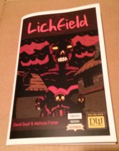
Awful Good Games has a booklet that is zine sized, i.e. half a page folded over. It is a module of 31 pages. It has a slick card stock cover and slick heavy paper for the pages. The text is black over light grey. It is legible as long as the slick paper does not have any glare. Older eyes with bifocals can have trouble with this. If you avoid glare on the page, unless your eyes are worse than mine, you will be able to read it.

Lichfield - by Awful Good Games
Lichfield – by Awful Good Games

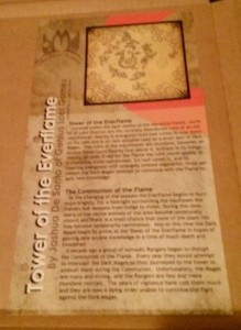
Next is a mini setting, a half page top to bottom ready for a standard three ring binder on slick card stock. It is black ink on a lightly colored background. It looks great, and as long as there is no glare, it too is easy to read. It continues adding to the Mythoard setting. I like that they keep adding things to the existing setting. If you want to use this setting in whole or in part, it is easy to do with this. I was glad to see that past month’s offerings are available. I would like to have the complete series of materials, if I can.

Tower of the Everflame

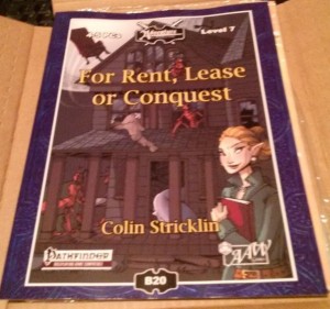
Next is a Pathfinder compatible supplement from AAW Games. It is For Rent, Lease or Conquest. It is a module about obtaining a home base for the party. It is a 42 page adventure. It is in a slick cover and the pages give one the visual impression of newsprint, but are slick and heavier than newsprint. The print is black ink on a multi-colored background. Most of each page has a light background, and thankfully the slick pages are not shiny. However, lighting and the angle the page is held can make words over darker ink harder to read for older eyes with bifocals. In addition, the layout has the text on some pages running into the border decoration. I think the intent is to look cool, but since it is hard for me to make out the text in some areas, and not every page is crowded, I think it is a layout issue. When the young eyes of the layout people read this stuff in 20 or 30 years, they will curse their younger selves. It is worst in sections of the page where the background color transitions from lighter to darker. Some letters disappear. In the corners of some pages is a leaf motif that goes light, dark, light and the odd color transition takes more concentration to read. I find that prolonged reading of this starts the feelings of a headache. It reminds me of the original PDF of D&D 5 where it had a colored background and was very hard to read. It seems like the intent is to go after the younger crowd at the expense of the older crowd.

For Rent, Lease or Conquest

The premise of the module is buying/occupying a building for home base and the villain is the realtor. I do not find that entertaining. As a homeowner who got screwed in the housing collapse, it is too much like papers and paychecks. That plus the difficulty in reading it, I don’t know if there are any useful nuggets in here.

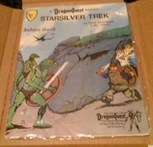
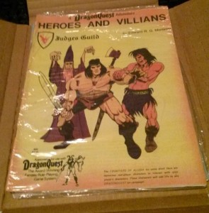
Finally, there are two Dragon’s Quest adventures from Judge’s Guild: Starsilver Trek, and Heroes and Villains. They are in clear sealed plastic. If this is the original plastic and still sealed, do I want to open them? While these were from Bad Mike’s Books and Games, are they worth more sealed? There are definitely from back in the day and the art is of the sort that did not draw me in back then. Some of the JG stuff is really good and I wish I had delved into it back then.

Starsilver Trek
Starsilver Trek
Heroes and Villains
Heroes and Villains

So there is a lot of stuff in here. Some of it is for younger/better eyes than mine. As with “grab bags” one cannot expect everything to hit the sweet spot.

I found some things to interest me, and some ideas for later.

2015 One Page Dungeon Contest – My Revised Submission

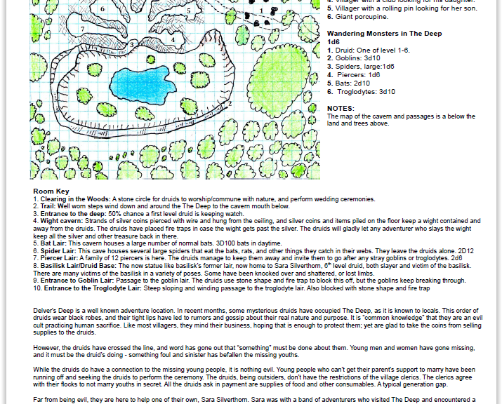
I re-did the map for my OPDC submission, The Dire Druids of Delver’s Deep. I did the new map by hand and scanned it. The only thing I put on the image with a program, are the numbers for the rooms/areas.

Doing my map old school, i.e. like I did when I was a teenager and before we had our first computer, microwave, or cable TV.

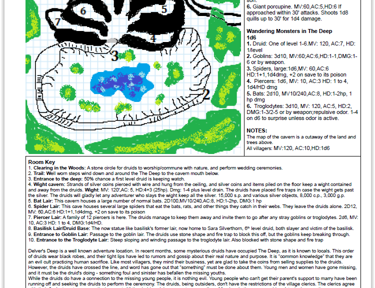
I’m not that good at getting the result I want out of a graphic’s program, so hand drawn it is. Being out of practice with the details on hand drawn maps doesn’t seem to be a problem for this small one. If I had time before the deadline to fiddle with it and get a cutaway effect of The Deep and the cavern, I would.


2015 One Page Dungeon Contest – My Submission

I said that I was going to submit something to the One Page Dungeon Contest (OPDC) this year, and I was beginning to wonder if I would make it happen.

Last weekend, the title I had for the dungeon finally gelled and the idea for it came together much more smoothly than I had hoped.

I wanted it to be about Druids, since I got on a kick and had a few articles about druids a few weeks ago.

Druids and Alignment

Druids and Their Environment

Druids and Undead

I also ordered Roberts Kunt’s module Dark Druids and when it came a week ago, I realized that I didn’t want to read it until I put together my idea for the OPDC.

I had determined that I would consolidate my notes and make this one page dungeon this weekend no matter what. I had to further get it nearly 100% today, since +Roy Snyder’s DCC game picks up after a hiatus of a few weeks, and I made a commitment to be there.

So without further ado, I present my submission to the OPDC – The Dark Druids of Delver’s Deep. I went “old school” on the OPDC and used the one page dungeon template by +Michael Shorten, AKS Chgowiz. He has links to his dungeon and wilderness templates on his old blog.

There are 36 listed submitted dungeons/adventures so far – at the time of this writing, minus my submission.

Mythoard Arrived

My March Mythoard arrived two days ago. I had time to take pictures, but that was on the same day as my Wednesday night online AD&D game I play in, so I am just now writing about it. There have been other reviews, but I’m putting in my two cents here.

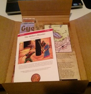
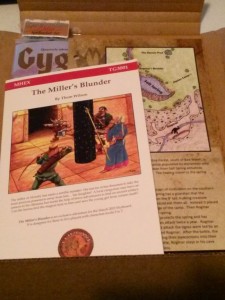
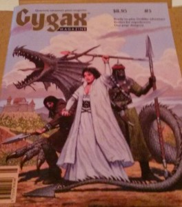
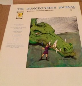
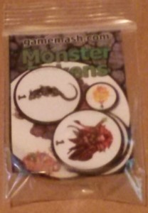
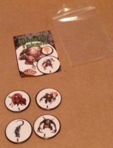
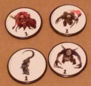
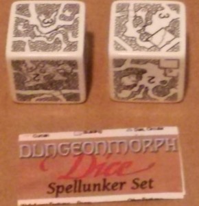
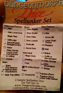
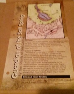
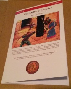
It included Gygax Magazine #5, The Dungeoneers Journal February/March 1981, a one page adventure from +Tim Shorts of Gothridge Manor, a mini module, The Miller’s Blunder, by Thom Wilson, two sample dice of the Inkwell Ideas dungeon Morph dice, and a set of four magnetic monster mash tokens.

This issue of Gygax Magazine is the one with the winner of the 2014 One-Page Dungeon Contest. I have one or two other issues that I have picked up at cons, but I haven’t had time to read the other(s) I have. It reminds me of the old Dragon Magazine from back in the day – Cool art, some stuff for ideas, some stuff I might use, a lot of stuff I will never use, and some comics in the back. I like Order of The Stick, and follow the web comic. I did not learn about OOTS until I found it online a few years ago. There have been a lot of complaints about Gygax magazine being slow to publish, but if you didn’t pay for a subscription, like me, it isn’t a problem. I will read them eventually.

There is familiarity to the issue of The Dungeoneer’s Journal. I think I saw it on the shelves of my FLGS back in the day, and/or some of my friends may have had it. It is familiar. Articles on games I never played, some I dabbled in, and more. Judge’s Guild material is something my brother and I tended to avoid, because it was “rough” in appearance. We had “advanced” D&D and were above those rough looking materials. I have learned in the last few years, that those rough looking things I snubbed had some good ideas in them, and I have them now in PDF, and some I have backed Kickstarters to get. I plan to read through this when time allows.

I did not realize that the adventure materials put out in all the Mythoards use a standard campaign setting, so they are set in the same world, or can easily be crafted to your own world. Tim Short’s “Guardian of the Sale Spring”, is printed on a slick, heavy card stock that is three-hole punched. The material is high quality. The printing and art is well done. I have not yet seen one of Tim’s adventures in person. This format of a small map, area description, and a random chart are so simple that I find that I could easily incorporate this into my own campaign. I am the type of DM who has to take way more time to read and understand a module designed by someone else to make it “mine”. It would be quicker and easier just to develop my own adventure. The simplicity of this overcomes my barriers. A series of mini-modules in one larger module would also get past my issues of running stuff written by others.

The Miller’s Blunder is a mini-module by Thom Wilson of throwigames.com. It is a center stapled, card stock covered booklet. It is only 17 pages with the inside of the back cover as the last page. The text is enough to set the scene and make it clear what is going on. The goals are clear and the various outcomes for the players are covered. While a lot more information than a back and front mini adventure, Thom Wilson has presented the pertinant facts in a way, that I could also easily make this fit into my campaign. I have not yet read the whole thing in detail, but reading the set up and skimming the rest, it is well designed and presented. The quality of this booklet is quite high.

I already have a set of dice from Inkwell Ideas from backing the DungeonMorphs 2: Cities & Villages: Map Generator Dice/Cards Kickstarter. They go well with the ones I already have, that I wrote about here. I am still waiting for fulfillment of the new dice in the series, so I’ll have more on that later. I backed the Kickstarter because I wanted some dice to help map/guide exploring the ruined city in my campaign, that my series for the 2015 A to Z Challenge is helping me collect my thoughts. These dice are large and have heft. They are loud on my plastic table, and would be on any table. Perhaps a padded box to roll them in would help if it is too loud for you, or too annoying for others you live with. Quick random dungeons are helpful. I like the ideas of the geomorphs, and Inkwell Ideas has started a series of contests for generating more geomorphs.

Finally, there are four round, magnetic monster tokens from gamemash.com. I’m not sure how I would use these other than on my refrigerator. I suppose they might come in handy to show placement in live play. For those who have to have more than scribbles on paper to do placement of characters, NPC’s, and monsters in play, these might be your thing. They are not my thing. I am not knocking the product. The art is good, and firmly attached to the magnets. The magnets have some heft to them, so they would not be easily moved, even if you don’t have a magnetic playing surface.

01-CAM00678
02-CAM00679
03-CAM00680
04-CAM00681
05-CAM00682
06-CAM00683
07-CAM00684
08-CAM00685
09-CAM00686
11-CAM00688
12-CAM00689
12-CAM00690

Wall of Text

I am guilty of writing massive posts that fall under the heading of Walls of Text.

I think I have some good ideas in there, and since I tend to write stream of consciousness usually with as few notes as possible, I end up with a massive wall of text.

I came up with an idea to have fun with this.

There is a massive wall of text and the adventurers need to find the key of TL;DR to surpass it.

I first had this idea in February of last year, but did not get the graphic put together until recently. My Gimp-fu and Inkscape-fu aren’t up to executing the image in my head, but it gives the idea. My freehand drawing skills aren’t there either. I imagine a giant wall with text filling each brick/stone/block in the wall, with a big and imposing presence.

I had thought of making this my entry in the 2015 One Page Dungeon Contest, but I need a better graphic, and a better idea for the adventure, so that this could be a real submission.

Whither the OSR Superstar Contest?

I had this article scheduled to post on March 6th, but Erik beat me to it and announced the resolution here.

Not what any of us wanted, but a conclusion nonetheless.

Below is what I wrote.

In 2014, Erik Tenkar, over at Tenkar’s Tavern, held a contest for the OSR Superstar. It got down to the finalists in July and there were some delays on the final judging. Up until Erik re-organized his page, there was a largish graphic about the contest.

I posted a comment to the OSR Superstar page asking about it a few months back, and I have seen others ask about it in other forums.

It is understandable if judges dropped out, or something else beyond Erik’s control. Did the finalists not submit? He is a NYPD officer, so his job comes with stresses most of us will never encounter.

Erik usually keeps all the Tavern’s readers in the loop. If he has mentioned it, I have not encountered the explanation.

If it’s resolution is dead or will eventually be resolved, I would like to know. I had a submission, I did not win. The submissions that did well were very cool, and I am curious to see what the finalists come up with for the final challenge.

I know that Erik is looking forward to retirement soon, sometime in the next year, I believe. I would ask that he wrap up a soon to be year old contest before then, so he can focus on the good content he regularly provides.