Tag Archives: Mythoard

May Mythoard Review

I received my May Mythoard on Saturday, but have been very busy. My weekend was full of lawn care and gardening, and this week has been crazy busy with work. I got pictures when I opened it, but haven’t written it up until now.

Work greatly slowed down today, so my energy level and general enthusiasm to concentrate on anything is still here. My last post in my scheduled posts ran out yesterday, so the timing is perfect!

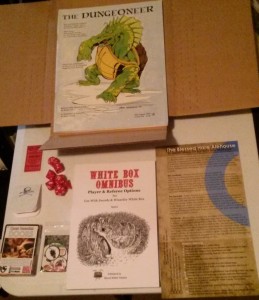
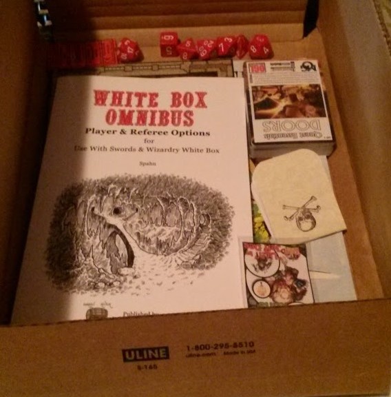
Group Shot
Group Shot

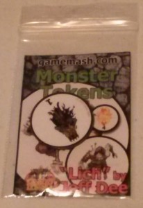
A monster token of a Lich, I think. These aren’t my thing, but the art is cool and it’s a magnet. You’re not supposed to be able to see the surface of your refrigerator, right?

Monster Token
Monster Token

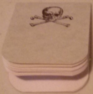
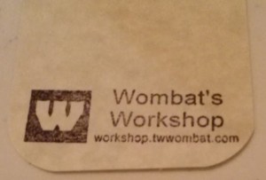
The Wombat Notepad is tiny! It is two inches by two and a half inches, with 16 pages. I like the cool skull and crossbones graphic. I am not sure how practical such a small pad would be. It is well made but is just not my thing. If a tiny notebook is what you’re after, then this is it.

Wombat Notepad
Wombat Notepad
Wombat Notepad
Wombat Notepad

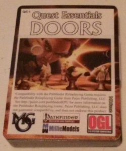
Ideas for doors. I don’t know that I would have bought this if I saw it at my FLGS. It has some interesting ideas. It has cards for doors, traps, and special. Of course, it says that it requires the Pathfinder RPG to use the cards. I take it that Pathfinder has very specific rules for doors. One can easily take the ideas in this deck and use it for any game. I’ll go through this in detail later, but I am sure it will add some variety to the doors placed in different location in my games.

How many doors can you describe?

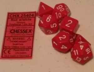
How did they know I didn’t have enough dice! I like the color. My mom would approve, red was her favorite color. After the recent video about testing the balance of dice, I wonder….

Chessex Red Dice
Chessex Red Dice

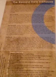
The Blessed Alehouse Tavern is a continuation in the series of the Mythoard setting. This half-page stiff card stock has a description, 3 NPC’s and a d12 rumor table on one side and a map of the tavern on the other. Unlike the last two Mythoard’s this one is not hole punched. The tavern map would be marred if it were punched since the art goes all the way to the edges. Without the holes, one has to have a notebook with pockets or other means to carry it securely.

This is a cool tavern that would work in any small village, and is a good example for others to come up with ideas for their own taverns in other locations.

Tavern!
Tavern!

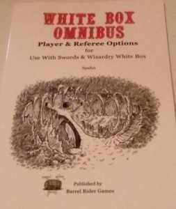
+Jame’s Spahn’s White Box Omnibus softcover. I won a PDF of this on an RPG podcast for Swords & Wizardry Appreciation Day.

I wrote a favorable review of the PDF and find that the book is well made and easily a handy resource for the table. Real old school is being able to game without electricity. 😉

White Box Omnibus
White Box Omnibus

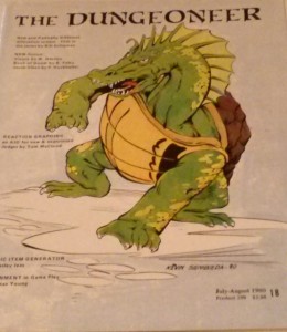
I am really liking these old school magazines! This issue has 408 Elven names and their meanings from The Silmarillion. I like lists like this. My brother, Robert, made a handwritten list of his own from various books by Tolkien so players could make up their Elven and Helf-Elven character’s names. It was also used for him to generate NPC’s. I think I typed up a copy myself. If I can find that copy, I will compare it to this list.

Dungeoneer #18
Dungeoneer #18

This month’s Mythoard had more things that I am likely to use in a real game, or to give me ideas to use in a real game, than some of the stuff from last month.

Review – April Mythoard

I had a package in the mail on Friday, May 8th. I had forgotten that I ordered the April Mythoard. However, I had a feeling that there was something that should be coming in.

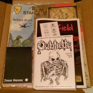
April 2015 Mythoard
April 2015 Mythoard

I had not planned to get it, but when I saw that it contained the latest edition of Oubliette #9, I was curious. I had read other positive comments about it, and knew that I would get some other cool goodies along with it, so I took the plunge.

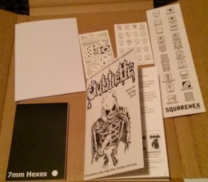
Squarehex Products
Squarehex Products

Along with Oubliette #9 are several other goodies from Squarehex. There is a book mark with large squares on one side and the other side contains large squares with dungeon map symbols. There are two business card sized items. One is blank on one side, and the other side had hexes with outdoor map symbols. The other small card has dungeon map symbols that are black and the other side has the same symbols in gray with labels to explain them. I am not sure if the purpose of these symbols is to give you an example of what such symbols “should” or might look like, or if you are supposed to put them under your hex paper to help you draw a very neat map.

There is a folded piece of graph paper the same size as the Oubliette issue with the grid on the outside. The inside of the graph paper has the OGL license. I wonder if it it the innermost page of the zine, and did not get stapled. Finally, there is a small pad of 7 mm hex paper. The pad it not as wide as a business card, and it is about as tall as two business cards top to bottom. It is so small that it is for a very small area and it well suited to a micro map.

I expected the Oubliette zine to be a full page folded over, instead it is about a half page folded over. The introduction indicates that this is not the usual size. It is a slick card stock cover with click heavy weight interior pages. It is 20 pages counting the back cover, which is a table for generating hit points of creatures from 1/2 HD to 2 HD using a roll of one or more d20’s. Six pages are a mini adventure, two pages with four new spells. two pages on a variation on familiars, four new magic boots, a new monster, and second mini adventure of three pages. While not every idea will be used by everyone, there is a lot in these few pages.

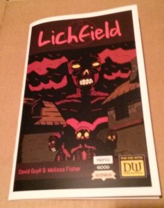
Awful Good Games has a booklet that is zine sized, i.e. half a page folded over. It is a module of 31 pages. It has a slick card stock cover and slick heavy paper for the pages. The text is black over light grey. It is legible as long as the slick paper does not have any glare. Older eyes with bifocals can have trouble with this. If you avoid glare on the page, unless your eyes are worse than mine, you will be able to read it.

Lichfield - by Awful Good Games
Lichfield – by Awful Good Games

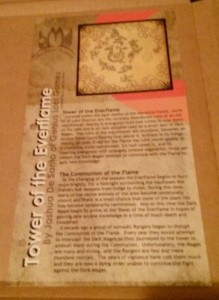
Next is a mini setting, a half page top to bottom ready for a standard three ring binder on slick card stock. It is black ink on a lightly colored background. It looks great, and as long as there is no glare, it too is easy to read. It continues adding to the Mythoard setting. I like that they keep adding things to the existing setting. If you want to use this setting in whole or in part, it is easy to do with this. I was glad to see that past month’s offerings are available. I would like to have the complete series of materials, if I can.

Tower of the Everflame

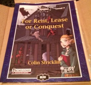
Next is a Pathfinder compatible supplement from AAW Games. It is For Rent, Lease or Conquest. It is a module about obtaining a home base for the party. It is a 42 page adventure. It is in a slick cover and the pages give one the visual impression of newsprint, but are slick and heavier than newsprint. The print is black ink on a multi-colored background. Most of each page has a light background, and thankfully the slick pages are not shiny. However, lighting and the angle the page is held can make words over darker ink harder to read for older eyes with bifocals. In addition, the layout has the text on some pages running into the border decoration. I think the intent is to look cool, but since it is hard for me to make out the text in some areas, and not every page is crowded, I think it is a layout issue. When the young eyes of the layout people read this stuff in 20 or 30 years, they will curse their younger selves. It is worst in sections of the page where the background color transitions from lighter to darker. Some letters disappear. In the corners of some pages is a leaf motif that goes light, dark, light and the odd color transition takes more concentration to read. I find that prolonged reading of this starts the feelings of a headache. It reminds me of the original PDF of D&D 5 where it had a colored background and was very hard to read. It seems like the intent is to go after the younger crowd at the expense of the older crowd.

For Rent, Lease or Conquest

The premise of the module is buying/occupying a building for home base and the villain is the realtor. I do not find that entertaining. As a homeowner who got screwed in the housing collapse, it is too much like papers and paychecks. That plus the difficulty in reading it, I don’t know if there are any useful nuggets in here.

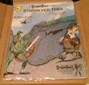
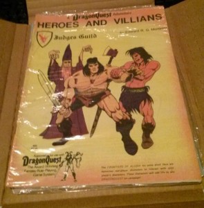
Finally, there are two Dragon’s Quest adventures from Judge’s Guild: Starsilver Trek, and Heroes and Villains. They are in clear sealed plastic. If this is the original plastic and still sealed, do I want to open them? While these were from Bad Mike’s Books and Games, are they worth more sealed? There are definitely from back in the day and the art is of the sort that did not draw me in back then. Some of the JG stuff is really good and I wish I had delved into it back then.

Starsilver Trek
Starsilver Trek

Heroes and Villains
Heroes and Villains

So there is a lot of stuff in here. Some of it is for younger/better eyes than mine. As with “grab bags” one cannot expect everything to hit the sweet spot.

I found some things to interest me, and some ideas for later.

Mythoard Arrived

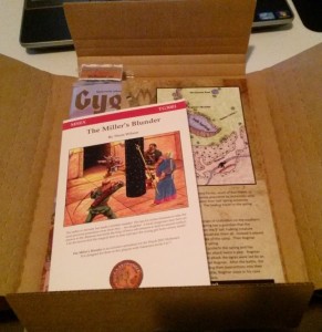
My March Mythoard arrived two days ago. I had time to take pictures, but that was on the same day as my Wednesday night online AD&D game I play in, so I am just now writing about it. There have been other reviews, but I’m putting in my two cents here.

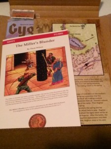
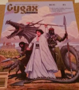
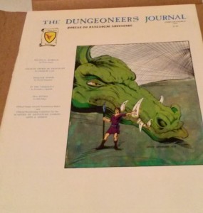
It included Gygax Magazine #5, The Dungeoneers Journal February/March 1981, a one page adventure from +Tim Shorts of Gothridge Manor, a mini module, The Miller’s Blunder, by Thom Wilson, two sample dice of the Inkwell Ideas dungeon Morph dice, and a set of four magnetic monster mash tokens.

This issue of Gygax Magazine is the one with the winner of the 2014 One-Page Dungeon Contest. I have one or two other issues that I have picked up at cons, but I haven’t had time to read the other(s) I have. It reminds me of the old Dragon Magazine from back in the day – Cool art, some stuff for ideas, some stuff I might use, a lot of stuff I will never use, and some comics in the back. I like Order of The Stick, and follow the web comic. I did not learn about OOTS until I found it online a few years ago. There have been a lot of complaints about Gygax magazine being slow to publish, but if you didn’t pay for a subscription, like me, it isn’t a problem. I will read them eventually.

There is familiarity to the issue of The Dungeoneer’s Journal. I think I saw it on the shelves of my FLGS back in the day, and/or some of my friends may have had it. It is familiar. Articles on games I never played, some I dabbled in, and more. Judge’s Guild material is something my brother and I tended to avoid, because it was “rough” in appearance. We had “advanced” D&D and were above those rough looking materials. I have learned in the last few years, that those rough looking things I snubbed had some good ideas in them, and I have them now in PDF, and some I have backed Kickstarters to get. I plan to read through this when time allows.

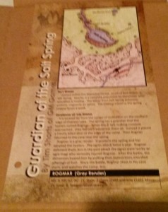
I did not realize that the adventure materials put out in all the Mythoards use a standard campaign setting, so they are set in the same world, or can easily be crafted to your own world. Tim Short’s “Guardian of the Sale Spring”, is printed on a slick, heavy card stock that is three-hole punched. The material is high quality. The printing and art is well done. I have not yet seen one of Tim’s adventures in person. This format of a small map, area description, and a random chart are so simple that I find that I could easily incorporate this into my own campaign. I am the type of DM who has to take way more time to read and understand a module designed by someone else to make it “mine”. It would be quicker and easier just to develop my own adventure. The simplicity of this overcomes my barriers. A series of mini-modules in one larger module would also get past my issues of running stuff written by others.

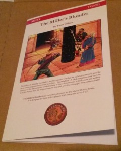
The Miller’s Blunder is a mini-module by Thom Wilson of throwigames.com. It is a center stapled, card stock covered booklet. It is only 17 pages with the inside of the back cover as the last page. The text is enough to set the scene and make it clear what is going on. The goals are clear and the various outcomes for the players are covered. While a lot more information than a back and front mini adventure, Thom Wilson has presented the pertinant facts in a way, that I could also easily make this fit into my campaign. I have not yet read the whole thing in detail, but reading the set up and skimming the rest, it is well designed and presented. The quality of this booklet is quite high.

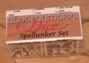
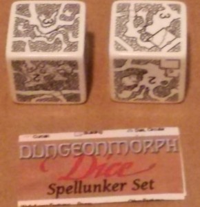
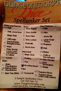
I already have a set of dice from Inkwell Ideas from backing the DungeonMorphs 2: Cities & Villages: Map Generator Dice/Cards Kickstarter. They go well with the ones I already have, that I wrote about here. I am still waiting for fulfillment of the new dice in the series, so I’ll have more on that later. I backed the Kickstarter because I wanted some dice to help map/guide exploring the ruined city in my campaign, that my series for the 2015 A to Z Challenge is helping me collect my thoughts. These dice are large and have heft. They are loud on my plastic table, and would be on any table. Perhaps a padded box to roll them in would help if it is too loud for you, or too annoying for others you live with. Quick random dungeons are helpful. I like the ideas of the geomorphs, and Inkwell Ideas has started a series of contests for generating more geomorphs.

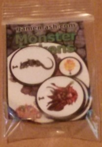
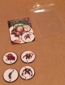
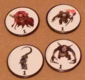
Finally, there are four round, magnetic monster tokens from gamemash.com. I’m not sure how I would use these other than on my refrigerator. I suppose they might come in handy to show placement in live play. For those who have to have more than scribbles on paper to do placement of characters, NPC’s, and monsters in play, these might be your thing. They are not my thing. I am not knocking the product. The art is good, and firmly attached to the magnets. The magnets have some heft to them, so they would not be easily moved, even if you don’t have a magnetic playing surface.

01-CAM00678
02-CAM00679
03-CAM00680
04-CAM00681
05-CAM00682
06-CAM00683
07-CAM00684
08-CAM00685
09-CAM00686
11-CAM00688
12-CAM00689
12-CAM00690