
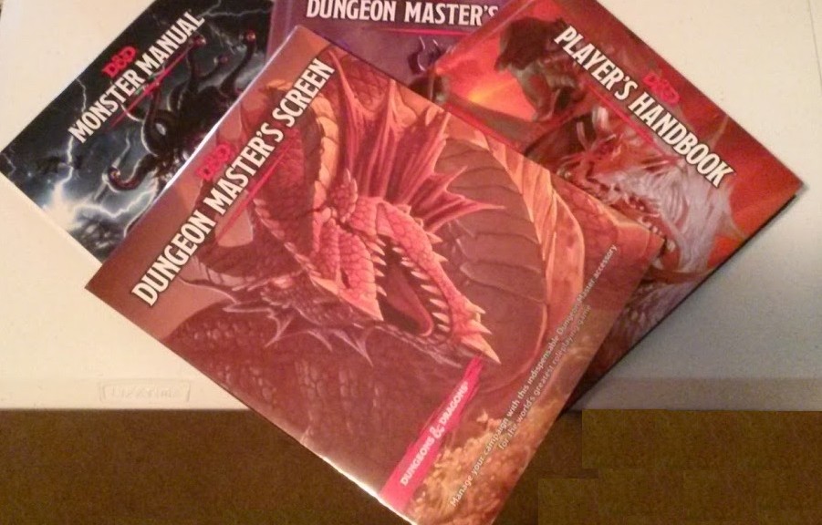
There was a half off sale on the new D&D 5e manuals on Amazon, so I went ahead and ordered all three of them, plus a DM screen. I already have the starter set and the free PDF’s, that I still have yet to read.
Serendipitously, these manuals and my DCC dice arrived on the same day.
I was surprised that the manuals were not wrapped in anything to protect them from rubbing against each other in shipment, or packed together so they did not slide. There was only one “airbag” on the bottom edge of the books to limit how much they moved, but there was still nearly two inches of empty space along the top edge and about two inches of space along the edge of the spine/edge of the pages. Not a lot of space, but enough room for them to rattle around in the box.


The front and back covers, the spine, pages, and most of the edges look fine, but there is a small area that is roughed up on the pointy corner. It is minor, and if these books get read and used at the table, worse will befall them. I just prefer that a book be in good shape when I buy it new, and that I am the one who drops it or scuffs it up through use and abuse.


I also noticed that the edge of the pages were wavy. I don’t know if that is a manufacturing thing, or that the weather was extra humid the day the package arrived. After sitting stacked in the box on the floor in my office, the Player’s Handbook [Amazon Affiliate link] does not appear to have wavy pages on the long edge, but the DMG [Amazon Affiliate link], and Monster Manual [Amazon Affiliate link] do. The tops and bottoms of the edges of the pages of all three manuals had obvious “waves” in them. The Player’s Handbook was on top, with the DMG next, and the Monster Manual on the bottom, and that did not seem to press them out. I don’t know if that is a manufacturing issue or a weather issue. Again, this is minor enough that I won’t ship them back.

The manuals have slick and shiny covers, except for the half of the back cover where one’s right hand fingers would grip it while reading. Each manual has this. I assume it is to give you a better grip on the book. I was surprised by this, and at first thought there was something amiss with the cover, until I realized it was intentional. The slick, shiny part of the covers is mirror-like.
The interior pages are black ink on a colored background with shiny paper. As long as you avoid bright light shining on the page at an angle that makes the text unreadable, the text appears to be easy to read. One should definitely avoid trying to read this in low light to avoid eye strain, and most likely a headache.
The illustrations are a mix of line art and full color pictures. A quick flip through reveals some very cool images.
I will review the contents of the manuals in subsequent articles.
DM Screen
As I was taking pictures for the unboxing, I noticed that the three books were all made in the USA, but that the DM Screen [Amazon Affiliate link] was made in China. The shrink wrap on the DM Screen was very tight, protecting it in shipping, but also requiring care in its removal to avoid gouging the screen. Once unwrapped, I discovered that it had a cover that has the same dragon as is on the screen and the inside is what I assume is a lich “poster” advertising the D&D Adventurers League.

Unlike the AD&D DM Screen I am used to from AD&D that is two pieces with a portrait orientation and each section is approximately the size of a sheet of paper, the 5e DM Screen is one piece with four sections in landscape orientation.
One page has five tables for generating NPC’s: characteristics, ideals, bonds, flaws, and a name generator. These handy tables would work in any setting or set of rules.
A page and a half is dedicated to conditions. There are bullet points that summarize each condition. Some of the points indicate if the condition results in disadvantage or how saving throws are affected. I have not read the manuals to see any details in the manuals on the conditions, but the bullet points seem fairly straightforward. I am not sure that the conditions need spelled out here. I suppose for players that argue the rules and try to rules lawyer the DM? This section ends with a chart showing the effects of the six levels of exhaustion. Level six is death! From what I have read online about a short rest and healing, just take five and you won’t die. I’m curious about how all that works, so time will tell.
The other half of the page shared with conditions are five tables showing the DC for various difficulties, cover, obscured areas (AKA concealment), light sources, and skills and associated abilities.
The final page has five tables for travel pace, encounter distance based on terrain and how far visibility is both audibly and visibly, and damage by level and severity. Finishing the charts are two tables for something happens and quick finds. These last two tables are again something that can be used in any other game/genre.
The interior and exterior artwork of the screen is very cool.
The finish on the screen is shiny. If a light is shining directly on it, the DM side with the charts and information is unreadable. The shininess of the finish makes it mirror-like, and makes it hard to read. At normal distance from the table with it positioned like I would have it to run a game, I find that the print is small and difficult to line up my bifocals to read it without having to lean over or pick it up. Since most of the information on the screen is fairly common sense, and you won’t be generating a lot of NPC’s and events on the fly all the time, it should not be an issue for most DM’s. As a screen, it serves its purpose. The folds/creases of the screen are “tight” to begin with, so it wanted to fold up until I had it open a while. It seems too low to me, but that is because I am used to the AD&D DM screen. If one is worried about players seeing something, I think you will be worried no matter how tall your screen is.
Once I read all the rules, shame on me for not reading the quick start and the PDF’s sooner, and know more about it, I can give a better assessment of whether or not the charts and tables on the screen are the ones most needed in play.
No one at WoTC must wear bifocals or have vision that needs correction. While the manuals and screen look cool, their shininess makes them hard to use in the wrong angle and brightness of light. The target demographic is obviously one with younger eyes. This is similar to the issues with the original free PDF’s that were nearly unreadable with the full color backgrounds. Thankfully, they released the plain black text on a white background for printing, but it was also more legible. Thankfully, the actual manuals are much easier on the eyes, and easy to ready, provided you don’t have adverse lighting.
I was hoping to start reading these manuals over Memorial Day weekend, but two “quick” projects for Saturday ended up taking all day. Sunday, I played in +Roy Snyder’s DCC game. Monday, I rested up. I couldn’t keep my eyes open to read.

One thought on “The 5e Plunge – Manuals Arrive”